i’ve been enjoying graphic design lately and all its quirks. My occupation relates to this field quite well, and i communicate and share feedback with designers daily. while perusing through barnes & noble with one of my friends, i noticed this one graphic design magazine that really caught my eye. it had old town fonts sprawled across its cover.
i then thought that the appeal of any graphics to a viewer should first and foremost be able to catch a viewer’s attention and not overbearingly so. it must be about balance, the juxtaposition of contrasting elements, and a visual harmony. so as i play around with graphic design and continue to learn more about its uses in this world, i will share what i have created on my spare time. for they are not my talents that i was given for my own personal use, but they were given to be shared with and used for good in the world.
below you will see the stuff i have played around with for fun 🙂
image one made for fun during work for upcoming local event:
image two made for personal use:

image three made after a fun 5k race that i ran with friends, in trying to understand inDesign i made up a magazine 🙂 
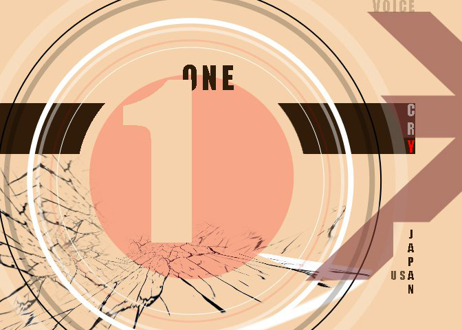
image four made in response to japan’s earthquake last year while a few close friends were overseas there:

🙂 so this is it for now.. i’ll try to make a new design at least once every week when i have the time, so i can have new portfolio pieces

Leave a comment